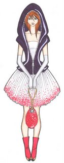
 panda-eyes designed a body bag hoodie and basic strapless cottton dress and noose inspired purse. I have to tell you. It was fabulous. The overall inspiration and exicution of the look was wonderful, and although the dress was basic the additive hoodie in PVC vynal was fabulous. It was ambitious. It was innovative. It had elements of risk. And it was a huge success. really love the whole contrast from the jacket to her boots. And I can definately see this going down the runway as something different and sleek, but at the same time...delicate. Excellent.
adriannauk...the design was a victim of a crime...but it was just a double strap v neck gown. It wasn't very symbolic in any way. Is this the same adriannauk from Cycle 2??? Adriannauk's focus of inpiration for this challenge wasn't the most creative...to me it was basically something predictable. If I were her, I would have at least added some holes and cut gashes in the dress to "make" it look more inspired by phsyical damage...anyways the dress ended up looking like a homeless person's gown. One thing to remember...no matter how ugly a challenge may be in terms of "subject"...always keep the flattering aspect of ANY design in mind. In this case, I can't see it being remembered, but forgotten. ON the bright side it was beautiful with all of the layers of the chiffon and it was wearable...but overall it was too basic and too boring to compete for a win.
sparklefly's design was strangled, and strangled quite elegantly if I do say so myself. The bust and bodice could have used some innovation, but other than that, it was completely fine. Making a design pretty based off of crime is definately an option, but making it inspired and believable is not an option, its a must. It was risky with all of those puffs and pulls...with that being said, it could have been tacky, but she did it right. I wasn't sure about the color of the jacket with the violet and glod ombred fabric...bud let's think of it this way. Jackets are meant to be removed. The whole concept of her being strangled came across really well! And not to mention is asthetically pleasing to look at and...well just a beautiful piece all together! Way to go sparkle!
lasmith...I personally didn't really get it. All of the rips, and the glass, and the "curtain fabric". It was all over the place! I know that these were put on for an added affect, and they could have worked...but they didn't. It looked kind of arbitrary. it doesn't exactly translate well. Sticking red strips of fabric all over a beautiful japanese old lady evening dress doesn't quite solve it because it loses the flattering factor. I see the vision, but I don't see the inspiration translated well or creatively...basically the execution is horrible. However, it did portray the look of someone falling out of a window...it just could have been more organized and flattering.
ceazar did great. It was definatly an ambitious design and it was modern fab, yet scary! The headdress was unusual...and I didn't really get it. The chains looked like they would be noisey, and you could have eaisily substituted it for some braided fabric...although it wouldn't have given you the same effect. I'm glad that he used jersey, a different fabric and leather. His signature gloves came back and it was a wonderful addition to the listing of entries.
wakasashe-fashion The design was in and out fabulous...but would you expect any less from him? The idea of arson as the crime was beautifully illustrated with and actual scene and the molotov cocktail accessory was an unexpected and eminent addition to the design. The main attraction as always with wakasashe's designs are the bodices. The sheer fabric for the bust, sequins, and silk all corresponded beautifully and was easily a contender for the win.
adeladia Aside from the drawing not being as up to par as I wanted it to be for this challenge...the inspiration and execution is definately there. The only problem im seeing is a shyness of not translating an inspiration as much as you can. The small little weights hanging on her garments should have been a lot bigger in my eyes...I mean come on, the only way you drown someone with weights is only if the weights are bigger and heavier. It could have been expressed in different sizes, but in different material so its appealing and different. It could have definately been an avant garde original. The overall look was interesting and it looked edgy and high fashion. I just didn't like the golden embroidered worms on the side. Other than that little matter of personal taste, it was very creative and keeping with the theme with the irridesent top.
ilani It was good, not great, but good. Decent. She seems to be sliding on through the compition. I however liked the prencess seams in the bodice and bust, and the unexpected fishnet top. I didn't really like the rippings on the bottom, but that's a matter of personal taste, and I feel like she could have definatly pushedthe design further.
catzilla
out: hankita
Still waiting for other judges' comments so check back!

0 Comments:
Post a Comment
<< Home