Judges Table: cjrogers1993, pkdesigner, realityundersiege, sparklefly, dedredhed
Critique:
Click the links
Critique:
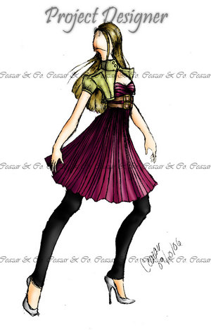
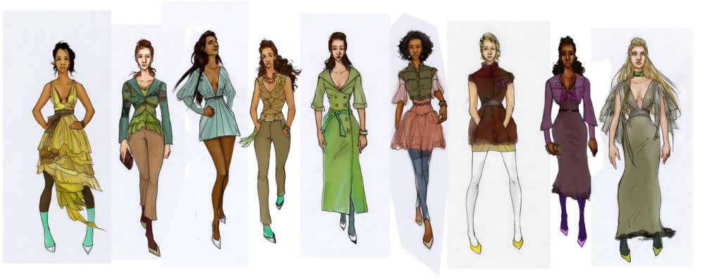
catzilla A very nice collection for fall, and with a bit more cohesiveness it would be a rather great ready to wear collection (I'm also not an expert on cohesiveness!). Some of the colors could use some tweaking, and usually in a collection there is a repetition of trims, fabrics, and styling details. We like the styling she has going on here- it's kinda artsy/preppy/boho. I love how she thought out each of the accesories, but we feel like some of the looks could have been styled a little edgier without losing their RTW capabilities. What I liked about Cat’s collection was how they where linked together so well through the colors, the patterns, and the cuts of the garments, yet look so different in their own right. 9 Different people with different tastes could pick one of these for there own sense of style. That’s a hard thing to do in a collection, and one can speak from experience. Every piece links to the next in little ways like accessories, patterns, but each piece has its own individuality. A great choice of colors used, lovely warm colors you would need in the fall. And also wha t I like is that the garments can suit a host of different body shapes, adding versatility to the collection. I saw a bit of this but not enough to tie the entire collection together. The only thing that seemed truly cohesive are the colors, which are fresh and beautiful, using colors that generally arent though of for fall and making them cheerful to wear while everyone is wearing blacks, grays, and neutrals in between, or seem to think it's ok to match their surroundings. A lot of these silhouettes are nothing special, dont get me wrong they're great and the usual customer isnt going to go beyond that much, but with the new drop waist silhouettes and plays with bubbles and puffs I was a bit sad to see only one true innovative silhouette in that line. But you arent afraid to play with details and accessories, which is great, just keep in mind that accessories arent wholly important in a clothing collection, as those are developed seperately. It's also good to know that you know more fabric terminations other than 'such and such colored fabric'. This would be a very cute line for the art college girl who isnt into exposing all her flesh to get attention, and neither is she going to result to being gaudy.
 t I like is that the garments can suit a host of different body shapes, adding versatility to the collection. I saw a bit of this but not enough to tie the entire collection together. The only thing that seemed truly cohesive are the colors, which are fresh and beautiful, using colors that generally arent though of for fall and making them cheerful to wear while everyone is wearing blacks, grays, and neutrals in between, or seem to think it's ok to match their surroundings. A lot of these silhouettes are nothing special, dont get me wrong they're great and the usual customer isnt going to go beyond that much, but with the new drop waist silhouettes and plays with bubbles and puffs I was a bit sad to see only one true innovative silhouette in that line. But you arent afraid to play with details and accessories, which is great, just keep in mind that accessories arent wholly important in a clothing collection, as those are developed seperately. It's also good to know that you know more fabric terminations other than 'such and such colored fabric'. This would be a very cute line for the art college girl who isnt into exposing all her flesh to get attention, and neither is she going to result to being gaudy.
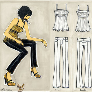
ceazar This line is full of frills and experimentations, and not that they cannot be carried out, but I think only a select few of these could be worn by the everyday person, and a lot of them are more flashbulb pieces...great on the runway and for gathering attention, but not very practical. Ceazar's collection was a stunning throwback to the the good ol' victorian days. We loved it! We loved your overall attention to the curve of a woman without resorting to exposing so much skin. We also like your use of ruffles and flounces, as it seems to be a reoccurring theme throughout the pieces. the styling is in the garments themselves...accessories aren't needed at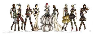 all. in fact, I'm glad that the accessories are minimal, with only a belt thrown in here and there to cinch the waist. Save for the two second to last pieces, there is a very renaissance feel to it (those two seem victorian/edwardian in a way). I think a few of the pieces may be a bit too manly for women today and might call attention to places a woman might want to keep looking small: her shoulders, hips, thighs etc. I am also a bit disappointed that these are just mere illustrations and I really cant tell the construction or fabrication, as you havent included any of that information for me. That is why I gave such a low cohesiveness score because in a line a repitition of colors, fabrics, details and trims is essential to not only cover cost but to offer an array of styles to your customer. One of us think you would make an excellent evening gown designer. You can tell he wasn’t afraid of bringing artistic flare in his designs, and taking risks and making a statement. The only links I could see between them was of the course the time period it was based on, using the same patterns and ruffles, but each design was completely different to next which was nice to see. I like to see each piece have its own personality. As Ceazar didn’t add any text describing each design, you would have a good look at the designs, and they do the speaking for themselves!
 all. in fact, I'm glad that the accessories are minimal, with only a belt thrown in here and there to cinch the waist. Save for the two second to last pieces, there is a very renaissance feel to it (those two seem victorian/edwardian in a way). I think a few of the pieces may be a bit too manly for women today and might call attention to places a woman might want to keep looking small: her shoulders, hips, thighs etc. I am also a bit disappointed that these are just mere illustrations and I really cant tell the construction or fabrication, as you havent included any of that information for me. That is why I gave such a low cohesiveness score because in a line a repitition of colors, fabrics, details and trims is essential to not only cover cost but to offer an array of styles to your customer. One of us think you would make an excellent evening gown designer. You can tell he wasn’t afraid of bringing artistic flare in his designs, and taking risks and making a statement. The only links I could see between them was of the course the time period it was based on, using the same patterns and ruffles, but each design was completely different to next which was nice to see. I like to see each piece have its own personality. As Ceazar didn’t add any text describing each design, you would have a good look at the designs, and they do the speaking for themselves!
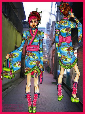
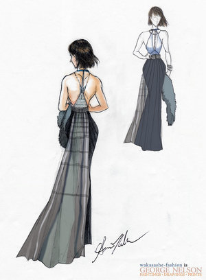
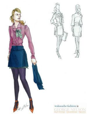
 wakasashe-fashion What a breath of fresh air! So elegant, femenine, refined, and just plain FRESH! I thought his collection was wearable, unique, and creative. Not to mention his showmanship was amazing! You can tell he really put alot of time and enegry into his whole collection and presentation. We have no doubt that you put a lot of time and effort into these images but very little information can be gathered from these images as far as construction or fabrication, and you didnt provide any details in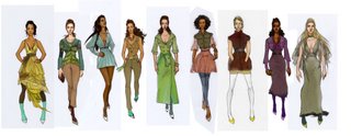 any of the descriptions. All the outfits were styled very professionally, but not so much that they would take away from the garment itself.You also seem to be using a wide array of fabrications, trims, and details, and not one of them connects to another garment: ruffles, cuts on bias, pleats, bubble skirts, flouncy sleeves, etc. Very few of the colors seem to match each other or represent enough coordination for mixing and matching. While the pieces do represent understated fashion and would make great modern pieces for a classy customer, again there is no coordination or cohesiveness. All in all: A lovely collection of wearable garments, with their own style, to suit near enough anyone tastes, with a healthy dose of high fashion. We could see these run down a runway for real! Any of these would give the wearer an air of confidence, which I believe was the point. It’s a very city feel for me this collection. You could see these in London or New York. They are wearable for everyday people yet not commercial. And that’s the best thing about the collection. I love the bold confident colors chosen and the cuts of the garments. And the shoes! Great stuff!
 any of the descriptions. All the outfits were styled very professionally, but not so much that they would take away from the garment itself.You also seem to be using a wide array of fabrications, trims, and details, and not one of them connects to another garment: ruffles, cuts on bias, pleats, bubble skirts, flouncy sleeves, etc. Very few of the colors seem to match each other or represent enough coordination for mixing and matching. While the pieces do represent understated fashion and would make great modern pieces for a classy customer, again there is no coordination or cohesiveness. All in all: A lovely collection of wearable garments, with their own style, to suit near enough anyone tastes, with a healthy dose of high fashion. We could see these run down a runway for real! Any of these would give the wearer an air of confidence, which I believe was the point. It’s a very city feel for me this collection. You could see these in London or New York. They are wearable for everyday people yet not commercial. And that’s the best thing about the collection. I love the bold confident colors chosen and the cuts of the garments. And the shoes! Great stuff!
Click the links
This was the BEST CYCLE YET!!!!
(3rd Place)
(2nd Place)
(Winner)
Congrats to the WINNER! You recieve two interviews with popular websites and blogs with over 4 Million views!!! You desrve it! And thanks to all of the contestants, and I hope we all keep in touch!!!
(2nd Place)
(Winner)
Congrats to the WINNER! You recieve two interviews with popular websites and blogs with over 4 Million views!!! You desrve it! And thanks to all of the contestants, and I hope we all keep in touch!!!
posted by christopher.john @ 5:27 PM
2 comments
![]()