 ceazar wins! The design was pulled together, it was sharp, and the styling was on point as always. We saw his design with elements of sparklefly's, and that was the point! The cut and fabrics were sleek, and the color choices were superb. The outfit looked fit for Kate Moss to wear to a party in the Hamptons! Magnifique!
wakasashe-fashion... to tell the truth, to me, it didn't seem like you changed the design very much. The differences I saw were the back, the stripe on the pants, and the ruffled hem on the jacket and sleeves. True, it might be your design asthetic...but it didn't really seem like a challenge for you.
panda-eyes...the dress wasn't as exuberant as I had expected. I was expecting more color (since he didn't list any that I am ware of) but the bolero was wonderfully exicuted. I wasn't in love with the "you can find this in the junior section" dress with the overlayer of chiffon, and the styling was way off. It was eluding, and I didn't have the patience to figure it out...
catzilla It was a little ho hum for me. The chiffon top with the vest and the skirt with fluted hem..yes..but...It was a bit too common sillouette for you. we know you do ready-to-wear and we totally admire that, yes the design was you but I feel as if I've seen it before...that skirt or maybe the vest. I'm merley releived that you're still in!
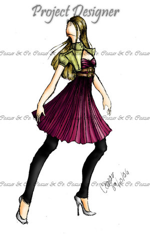
OUT:sparklefly The design was palaple...and was I the only one that didn't love it?I was releved to see that the pooping chiffon bustle had been removed. I definatly thought it was a very well exictued design, but for me the colors were a bit...LSU. I thought her deep violet dress with the exuberant gold trin and piping treatment looked great at first, but as I stared at it I thought: "Ive seen this before." To me, it was evident that the bustle would have benefited from more fabric, but it was too late for that. (Am I shedding a tear as I type this?)
posted by christopher.john @ 12:52 PM
![]()

0 Comments:
Post a Comment
<< Home