wakasashe-fashion Great job! It was good to see a risk being taken! And it paid off. We love the different layers and fabric, it gave so many different textures and dimensions to the design for me. The one concern one of us had was its versatility. I don't think this would suit a lot of people, it would take certain body shapes to pull it off wearing it. But that's his/her own opinion. The necklace is a great addition and finally, someone used a PRINT! I just wish the bows around the waist were a little more defined, because I had to read the description twice to figure out what they were. all in all though, a great showing. Its a brilliant and thought out design!
catzilla the blues are very calming, and i love that she used more than one shade.
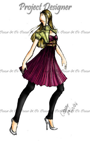
the pleats in the center are very attention-catching and add something unexpected to an otherwise classic dress. it probably provides great movement. great job!
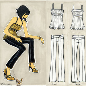
ceazar With a difficult colour to design with, Ceazar pulled it off really well. That well in fact the first I thought of seeing the design was Beyonce in that dress on a red carpet!
The only thing that let us down personally was that just the cut of the dress one of us doesn't love...that cutout in the front...does he need it? I think the dress would have been more successful without it, since the back of the dress is so open. The other concern was the placement of the rhinestone, from which the chiffon propelled. (I made that mistake too!) I do really love the skirt though. It's just the top of the dress we have problems with.
OUT:panda-eyes I was pleasantly surprised by Panda. A designer that has a edgy and fun look to her designs, came up with something so beautiful, and that fact you can see her style in her design makes it even better! well done Panda to not losing your style in something so different to design! i wish she would have chose a darker green for the dress, or something a little more vibrant than the sea foam green i see on my screen. I also think the blouse should be attached to the dress, because without it, it's just a plain strapless dress. on the positive side, i love that you can tell it's clearly her, with the ruffles on the front of the blouse, the cutout in the back, and the beaded hem. I think she had a great showing this week.
catzilla the blues are very calming, and i love that she used more than one shade.
the pleats in the center are very attention-catching and add something unexpected to an otherwise classic dress. it probably provides great movement. great job!
ceazar With a difficult colour to design with, Ceazar pulled it off really well. That well in fact the first I thought of seeing the design was Beyonce in that dress on a red carpet!
The only thing that let us down personally was that just the cut of the dress one of us doesn't love...that cutout in the front...does he need it? I think the dress would have been more successful without it, since the back of the dress is so open. The other concern was the placement of the rhinestone, from which the chiffon propelled. (I made that mistake too!) I do really love the skirt though. It's just the top of the dress we have problems with.
OUT:panda-eyes I was pleasantly surprised by Panda. A designer that has a edgy and fun look to her designs, came up with something so beautiful, and that fact you can see her style in her design makes it even better! well done Panda to not losing your style in something so different to design! i wish she would have chose a darker green for the dress, or something a little more vibrant than the sea foam green i see on my screen. I also think the blouse should be attached to the dress, because without it, it's just a plain strapless dress. on the positive side, i love that you can tell it's clearly her, with the ruffles on the front of the blouse, the cutout in the back, and the beaded hem. I think she had a great showing this week.
posted by christopher.john @ 11:30 AM
1 comments
![]()