Project Designer Cycle 4

Monday, July 31, 2006

panda-eyes designed a body bag hoodie and basic strapless cottton dress and noose inspired purse. I have to tell you. It was fabulous. The overall inspiration and exicution of the look was wonderful, and although the dress was basic the additive hoodie in PVC vynal was fabulous. It was ambitious. It was innovative. It had elements of risk. And it was a huge success. really love the whole contrast from the jacket to her boots. And I can definately see this going down the runway as something different and sleek, but at the same time...delicate. Excellent.

adriannauk...the design was a victim of a crime...but it was just a double strap v neck gown. It wasn't very symbolic in any way. Is this the same adriannauk from Cycle 2??? Adriannauk's focus of inpiration for this challenge wasn't the most creative...to me it was basically something predictable. If I were her, I would have at least added some holes and cut gashes in the dress to "make" it look more inspired by phsyical damage...anyways the dress ended up looking like a homeless person's gown. One thing to remember...no matter how ugly a challenge may be in terms of "subject"...always keep the flattering aspect of ANY design in mind. In this case, I can't see it being remembered, but forgotten. ON the bright side it was beautiful with all of the layers of the chiffon and it was wearable...but overall it was too basic and too boring to compete for a win.

sparklefly's design was strangled, and strangled quite elegantly if I do say so myself. The bust and bodice could have used some innovation, but other than that, it was completely fine. Making a design pretty based off of crime is definately an option, but making it inspired and believable is not an option, its a must. It was risky with all of those puffs and pulls...with that being said, it could have been tacky, but she did it right. I wasn't sure about the color of the jacket with the violet and glod ombred fabric...bud let's think of it this way. Jackets are meant to be removed. The whole concept of her being strangled came across really well! And not to mention is asthetically pleasing to look at and...well just a beautiful piece all together! Way to go sparkle!

lasmith...I personally didn't really get it. All of the rips, and the glass, and the "curtain fabric". It was all over the place! I know that these were put on for an added affect, and they could have worked...but they didn't. It looked kind of arbitrary. it doesn't exactly translate well. Sticking red strips of fabric all over a beautiful japanese old lady evening dress doesn't quite solve it because it loses the flattering factor. I see the vision, but I don't see the inspiration translated well or creatively...basically the execution is horrible. However, it did portray the look of someone falling out of a window...it just could have been more organized and flattering.

ceazar did great. It was definatly an ambitious design and it was modern fab, yet scary! The headdress was unusual...and I didn't really get it. The chains looked like they would be noisey, and you could have eaisily substituted it for some braided fabric...although it wouldn't have given you the same effect. I'm glad that he used jersey, a different fabric and leather. His signature gloves came back and it was a wonderful addition to the listing of entries.

wakasashe-fashion The design was in and out fabulous...but would you expect any less from him? The idea of arson as the crime was beautifully illustrated with and actual scene and the molotov cocktail accessory was an unexpected and eminent addition to the design. The main attraction as always with wakasashe's designs are the bodices. The sheer fabric for the bust, sequins, and silk all corresponded beautifully and was easily a contender for the win.

adeladia Aside from the drawing not being as up to par as I wanted it to be for this challenge...the inspiration and execution is definately there. The only problem im seeing is a shyness of not translating an inspiration as much as you can. The small little weights hanging on her garments should have been a lot bigger in my eyes...I mean come on, the only way you drown someone with weights is only if the weights are bigger and heavier. It could have been expressed in different sizes, but in different material so its appealing and different. It could have definately been an avant garde original. The overall look was interesting and it looked edgy and high fashion. I just didn't like the golden embroidered worms on the side. Other than that little matter of personal taste, it was very creative and keeping with the theme with the irridesent top.

ilani It was good, not great, but good. Decent. She seems to be sliding on through the compition. I however liked the prencess seams in the bodice and bust, and the unexpected fishnet top. I didn't really like the rippings on the bottom, but that's a matter of personal taste, and I feel like she could have definatly pushedthe design further.

catzilla


out: hankita

Still waiting for other judges' comments so check back!

Monday, July 24, 2006

catzilla Beautiful! So fresh and clean! The tailoring in all of her pieces is so unique. We love the cut of the skirt and the jacket especially. Fun, cute, classy, and classic! It was as evident as ever that her experience as a design student had provided her with all the right stuff for strategic decision-making and problem-solving. She was showing signs of heavy stress (with classes and all), and I became very concerned that she would be unable to finish this challenge. In the end, she pulled it off, perfectly! A job well done!

sparklefly the 1st shirt was pretty...I'll admit...and the coat was nice but so typical! I'll be honest I thought it was boring. And don't quote me on this one okay? But it looks so typical! how many times have you seen all of those outfits? A million! Besides that fact, it was at least decent. It would flatter any body type, it followed the design specifications, and it was at least half-way trendy. These outfits would be great for the office, a night on the town, or just about anything! The first two designs are a bit too simple, however the collar of the white blouse is really nice, and the coat is adorable. I'd put it in a store.

hankita First of all...she did the challenge incorrectly. She had 7 garments...not five. The 1st shirt was way too low and revealing...almost trashy (if the wrong person wore it). The first outfit is rather simple, the second is very modern but the hat just doesn't work with it, and the third looks comfy and wearable around the house or going jogging. Not quite sure how a hoodie goes with flip flops though. One of us thought she was going to have a seizure...it was so "limited too" like 4th grade girly...ish! The last outfit was decent...it wasn't too creative but it had a certain appeal to it that we kinda liked. All in all it was fabulous to me...but you should be lucky...you got more points than leashapore. If she had gotten 2 more points you would have been out..follow directions.

lasmith Alright..so we're all for the cute baby doll..vintage classic type cutes but that much of THAT striped fabric? What was she thinking? It's like mixing demure and elegant with pop princess! and not succeeding! I loved the coat...and I loved the cuts of the designs but that striped fabric just killed it! This challenge was about incorporating the chosen fabric into your designs to make beautiful pieces! Not making great designs and throwing in a random and totally different style fabric that kills the looks!

panda-eyes ONE of us said: cute...not amazing but cute. I liked the first shirt a lot. it has some adorable little apple buttons and a nice cut. The jacket was cute...not amazing but fairly nice. The walking shorts were a bit dull...strange color as well...The skirt was very cute. but that last top...can you say PRIVATE SCHOOL UNIFORM? no one wants to walk around looking like a kindergartener...I mean really now...this is not supposed to appeal to those in the first grade! So she took the apple term quite literally...and it was cute and all...just not that great. But personally, I loved it. It had an Anna Sui quality about it that was very calming and unique. Well done.

ilani The first and last designs are so uncreative! I've seen millions of them in department stores and all that crap...and no that they're even good designs anyways. The coat had this random cut in the right shoulder...it looked like she had bee attacked and her coat ripped...instead of it looking like a cohesive element in her design. I liked the skirt of the middle one..but other than that this one was a totally disappointment...Maybe next time you could experiment with the silhouette. Great color choices, great top designs, and adorable shoes! The black sheer top is a nice addition, but that makes for 3 tops in the designs, which is more than the challenge called for. The top with the poufy sleeves is adorable and looks like it would be a top seller in a store. As much as minishorts are in style at the moment, they look like regular minishorts, not specially designed ones. The coat and skirt definately stand out, in a good way, though they do not blend in as well with the other two designs as part of a collection. It would have made the designs even better.

ceazar It's good...We loved the shoes of the 2nd one and the bags! To die for! and I loved the shorts...I think he did a great job at making something unique and creative while still using the required fabrics.The patterns used are very flattering and feminine, as are the shapes of the garments. And an Apple Pie logo was created even! Great accessories. These designs would work wonderfully for someone who wants to be trendy and casual, or sexy and chic. To tell the truth it looked like he used more than 5 garments, and that's a win in itself! Hoorah!

adriannauk's line was decent and it was wearable and it looked accessible. I personally think that without a lining the chiffon top would reveal too much (especially because it's white) which takes away points. Poor usage of the fabrics I provided. These designs are lovely with that bit of couture flair. The colors and patterns are bold and elegant. There is a bit of vintage inspiration in these designs, adding more class to these gorgeous outfits. Love the smocking of the skirt waistband. And that jacket would definately turn heads when worn with any outfit. Seems almost boring and monochromatic... But the overall collective look was a plus for the line. Simple, austere, tailored, and sophisticated for the working woman.

Adeladia I personally on the creative side loved her collection. It was kind of modern and very ebullient which is a major factor in determining sales. It was definitely higher in terms of fashion and creativity than others and it was very interesting. The coat was kind of revealing with nothing in the front, but overall it was a solid simplistic design to seal her otherwise risky and colorful "mini-line". I wonder how many customers she would have because it seems a little out-there to me.

wakasashe-fashion designed a wide range of clothing that could me mixed and matched for any situation or scenario. It didn't even look like he used 5 garments, because he placed them strategicly...(the jacket over the shoulder). Are the pants on the first and second design the same, just with the first having the cuffs rolled? It sure looks like it, but the description doesn't say. The pink top is cute and fashionable, but the black vest looks a bit odd design wise (and without any details about it in the description, it's hard to figure it out). The green jacket also doesn't seem to match with the rest of the outfit. Were it not used with the pink top, it would look better but the colors still clash. The green jacket would look much better on the second design. They were chromatic, colorful, and kaleidoscopic, but he toned it down with the tweed which I loved. It was a great showing from wakasashe-fashion.

Out:
leashapore My concern was how would you wear a jacket Upside-down? It looked like two different jackets...I could understand inside-out, but upside-down? The skirt/short combo is really catchy, and the tops are very sexy, but what is going on with the jacket? How could wearing a jacket upside down possibly work or be comfortable? It's too confusing to figure out. And why the fabric badges? That is too literal for using the fabric swatches in the designs, and it doesn't really count either. It was in my personal taste, executed poorly and I really didn't understand or comprehend it at all...

Monday, July 17, 2006

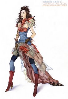
wakasashe-fashion The vision was there and it was wonderfully executed. I saw a housewife in the country going on a shopping spree in Milan, cutting things up and sewing them to her taste. Ah! Wonderful. Thankfully I see a cohesive perspective of all the fabrications thrown on it. It could have easily been a horrible design, but instead it's definitely a solid image of a hill billy's everyday outfit being reconstructed into Haute Couture. It fit's the taste of the environment. I think that for this challenge in particular the jumble of shredded fabrics and raccoon tail in the back work! and the top is gorgeous. Great design as usual.

lasmith To ZebrASkinn44..., I see Cinderella's dress re-styled into real Haute Couture, which is a good thing. As a whole, it has a flamboyant character to it...but the bottle caps throw this off. If this is worn on the "red carpet," I just see the coca cola embellishments as almost degrading the garment and turning it into a joke. The reason why is because everything else is fabricated so interesting...the braided squirrel fur as 1 example. The caps are tacky, cheap and placed all over as opposed to the bullets which actually "look" like real jewelry...the idea used here is designing something very raw and organic relating to the environment. I do not see an excellent execution with that. The great things about it was the overall look...but the bottle caps had to go.

ilani Fun colors... just not as creative as it could have been. Another design with potential that couldn't reach it. I like the off the shoulder blouse with that nice big puff insert of the sleeve...as well as the artsy hat because it defines what the challenge was about, but everything else is a disaster. The outfit looks as if everything has been crammed in one...in my eyes, this looks like super girl with a pair of overalls. One lesson in Couture is that wearability should always be a factor no matter how wild the look can be...in this challenge your not asked to do Couture and dress models on a runway. Yay for color! The red definately makes a bold statement. The headpiece keeps me staring. It's definately, well, um, I really don't know what to make of it, other than I wonder how that would look in real life. The use of a peasant top was something I expected to see a lot in this challenge, though I like this adaptation of the more common design. The jumper seems a tad short to me, but I guess that would be fine for hics. Those boots though. Whoa. Sleek, and they add a touch of class in my point of view, believe it or not. That mixed with the skirt-like effect. The outfit actually makes me think of a big iris, as in the flower. Definately a bold design, but I'm not sure it's couture enough.

adriannauk We got a few problems here. I understand Adriannauk isn't infatuated with Haute Couture, but there's a thing called "research" which can be done to execute or learn about anything. With that, she could have used her own design philosophy to her advantage but I see her design as an amateur take on trying to do Couture, but almost failing. Alls we see is a basic outfit with exaggerations...nothing more. The dungaree strap on the right side is horrible, taste wise and function wise. When this girl bends over, it will fall off her shoulder because the waist isn't high enough...something most dungaree pants OR overalls have traditionally in general. For good points, I think the colors work and the look is appropriate for the challenge....but we definitely would have liked a more researched design that also could have even been laid back. Unfortunately, my first reaction was "how are those pants staying on?!" The model's right side looks like the pants are slipping down. Not good. The top is a cute rendering of a suit, looking more like a peasant top, but shouldn't something be worn underneath? The model's breasts are about to pop right out of that top. And I'm not sure how comfy pants would be with the strap like that. It looks like it's a bit tight, and not in a good way. The pants are rather basic, as are all the fabrics used. And I'm not sure what hic would want to be running around in tall platforms. Doesn't seem very practical to me. I think this outfit could have been done much better just by altering the design slightly (adding a top under the jacket, and fixing the pant waist).

sparklefly I felt sparklefly to again, be rather restrained with her vision. It looked like a gingham dress with quilting and a v-neck bust with low back. That's it. realityundersiege said: A GREAT dress by sparklefly! One of her best ever I might say! I just loved the fabrications and the patterns so much! They just went together SO perfectly! The details of the quilting and little flowers made it even more wonderful! I have to say that this one and lasmiths are the two top for me at the moment. it just seems so harmonious and like very little detail was taken into consideration before the end product. LOVED IT! Hillbilly chic it certainly is! Talk about detail, wow. I love the quilting! It adds serious flair to this very elegant, yet hillbilly-inspired outfit. The whole bodice detailing is lovely, especially the little inserts. My only question is, is the skirt bustled like that, or is the model holding the skirt up? I can't quite tell. I love the little peasant top sleeves. My fav thing about this design is how from the front it looks quaint and sexy at the same time, without being crude, and from the back, it's very classy....different points of view.

Hankita Basically the most here that's thrown off is the materials used...chiffon and silk wouldn't be caught dead on a hill billy living in unconventional conditions and areas. Silk and Chiffon...usually expensive to buy doesn't generalize or represent hill billy's nor does it serve as an inspiration towards what hill billy clothes can be. Ultimately, the skirt is alright...the top looks way too close to civilization and the fabrics are totally off. Again, if one doesn't know something, research is available. I don't feel like the outfit blends well together...like the shirt and the top don't feel like they should be part of the same outfit...which is not a good thing...certainly not a timid piece..but not a successful one either. Ho hum. Another variant on a peasant top. I don't think I've ever seen a plaid chiffon before though. I like the slightly angled tiers of the skirt. The overall design is nice and modern, but I'm not sure that it fits well enough into the couture category. And I can't quite tell what's going on with the shirt, except that it is a type of peasant top, but I'm trying to figure out what's with the hem of it. It looks like it's either tattered or it's sewn to the skirt. A nice description of the outfit, rather than a listing of what's there, would have been good.

catzilla A contender or the win...with this challenge, designers were either horrible, or excellent. This is the excellent. Thank god that silk is the type it is because it fits in appropriately with the challenge and introduces a raw hill billy texture in high fashion material. It looks as if its quilted in the illustration. The layering done on the flared hem is wonderful because its both delicate and stylish with having a sheer fabric over a solid fabric scheme. The colors work and don't overdo each other...and the denim piece starting below the waist is most appropriate with belt loops...this clearly looks as if it were deconstructed from a pair of overalls and joined with a red halter dress. I honestly like it a lot. However...the purse has to go. It looks like a porn bag with XXX written on it.

ceazar This guy definately knows how to tease everyone with that shadowed preview he had up all week, because this is great! This has to be the most couture of the designs, though I would think nothing less from this designer. I'm loving the mock alligator-print top, though I'm not sure how comfy that turtleneck-styled collar would be. The exposed part of the back was unexpected and a bit daring without exposing too much. My only real question is how does someone get into this outfit? Where are the closures? Hmm. The pants are great, especially how the belt is done. And that pouf-effect below the knee, playing off the shirt concept is cute. Nice boots too! So yeah, my only nit-picking for this one is how would someone get in and out of this kind of outfit?

panda-eyes Everything is balanced and pretty quirky color scheme wise which we all love from panda-eyes. The nice big flaw I see slapped on this design is the bustle...and it definitely creates problems. First of all, why use it again when it was used previously in another challenge? Being a "neat idea" is no excuse cuz the bustle isn't exactly original and repeating that idea only makes you look like a copy cat with minimal vision versatility. Remember, style does not revolve around 1 vision/image or look. Also, it destroys the elegance this outfit had. The bustle just looks like a bunch of raccoon tales slapped on her behind....which it is. In Haute Couture, things should never be "over done" because it does really take away the fine quality any outfit has. But overall, a very cool design and in some of our books, a contender for the win. It's so hillbilly and yet it has some trendy bits mixed in really nicely. I like the brown tailored shirt and the vest. If those were used with another ensemble, she could just about pass as a business woman. Well, almost. The skirt certainly looks like something a hic could come up with from stuff lying around the house. There's those traditional aspects of hillbillies such as the neckerchief and the straw hat, which could've been done up a bit, along with the cowboy boots. Only one problem though. It's too hic chic, and not enough couture.

adelaida
Hehe, cute floppy hat. I like how the overalls aren't made with the usual straps and buckles, but instead with strands of iron rings. I do think that the design should've had at least one pocket though (the design is for hics...and I'm sure they'd have something to carry around). The lacy shirt looks like a nice business top with lace sewn over it, so that kind of loses out on creativity. And the belt just seems to be...well, sitting there. Shouldn't there be a belt loop or something somewhere? I do like the copper button down detail of the overalls though. The purse is really cute and trendy, and the boots are very feminine cowgirl. The outfit is nice, but not creative enough to be really couture.

leashapore Interesting and couture, but besides minimal idiosyncrasy, how in the world is it hillbilly? Uh...all I can say is "what IS it?" It looks like a crinkled wad of fabric...with some buttons... I'm even having a hard time figuring out the description... I am at a total loss... realityundersiege: It looks like someone crumpled up a piece of paper...and strangled BARBIE with it! omg...omg...you have got to be kidding me? is she aware of what contest she's in? has she givien the criteria of the challenge any consideration whatsoever?my goodness...it's frightening to look at!

OUT: deathofrats

Saturday, July 08, 2006

leashapore is the Winner!! None of us had anything bad to say about it. The elastic strap is not annoying because it's elastic and it stretches along with the women's body movements. I did have to look at this though for about 10 minutes cuz she didn't provide a back view...so, now I definately understand everything. The elastic band basically serves as the main "function" that holds it all together. 10 points for creativity...the corded piping is beautiful and unique as well as the whole sheerness of everything because ultimately...even the base garment underneath is not vulgar, but sexy and comfortable w/ being fabricated well. It's definately in fashion. The piping is something seen in handbags and even in construction so artsy innovations are in...as well as the baby doll sillhuoette. It's also modern and follows the rules of the challenge. Wereally like this in general.

panda-eyes was very literal with her design. This outfit lacks inspiration from the Capricorn as well as proper color coordination. The empire waisted dress looks like a baby blanket...the print is juvenile and cheap paired with the rest of the outfit. The capricorn expressed here is 100% literal. Alls we see is the symbol pasted on the dress and placed on the necklace. I don't believe it fit the challenge... yes, it could be used as underwear (AFTER the accessories were removed), and of course outerwear, but I do not understand how it could be lingerie whatsoever.

catzilla created a very beautiful and elegant design...but no crab? None what so ever? For all I know this could have been a moon godess design? We felt that the usage of the pearls (and not necessarily the cancer-print) was completely appropriate for conveying "cancer" on a morely subtle level than imposing and obvious. The lingere was VERY beautiful and sexy. Very creative, however we felt that certain aspects of the lingerie were unnecessarily sexy... somewhat vulgar. The ring on the backside of the panty was revealing in a way that compromised the sophistication, especially considering that she was given a shawl that demanded the rest of the outfit to uphold a tangible elegance that the actual shawl possessed. It's definately "In" fashion because this season...embellishment is the new trend according to the fashion shows. All of us think the colors and the embellishment details are beautiful.

lasmith created a shirt that is gorgeous and extremely creative with it's compromisable draping, however the pants totally weren't. But the pants rob the top of it's creativity. This is an example of when ambition gets the best of you. The creativity is wonderful but unnecessary...all those alternate looks aren't needed. Ultimately, your just making the challenge harder for yourself because your goal is to only create 1 daywear look and 1 sleepwear look which can be transitioned. It's obvious all the seperate broach looks were for daywear...which looked great, but the sleepwear is illustrated and looks like a 70s T-shirt put over a pair of capris. Just not flattering. If your gonna have a shirt THAT voluminous when not gathered as shown, you might as well go with a color that looks "light" in volume...you don't want a green cape slapped over your body, unless it's sheer/see-through. I can actually see the daywear looks being worn in bed if only the bottom was different...and yet again kills it. Why wear capris in bed? Well we don't know the fabric do we?

sparklefly Here's an example of big talk for such a simplistic design with simplistic detailing and inspiration.We like how it's inspired more simple because it shows that you don't have to go all conceptual...the challenge was taken more relaxed, however...the fabrics throw it off. In the description it says the "whole thing" is silk charmeuse. Charmeuse is a bit too hard even for lingerie to sleep in...I could see lingerie accented with inserts w/ charmeuse but not whole peices.

ceazar one of us felt that the legging... I feel is almost vulgarly provocative. Ironically,we also feel it to provide a sense of elegance and class (almost 1940s which I love...) that wouldn't've existed otherwise. In end, it's interesting with the back and frilly with the virgo trim. It's elegant, yet still... a cocktail dress. The sequins were nicely added in the shape of the stars, and looked great on the design. Ceazar, anoher job well done!

Hankita This design gave us little trouble. It reminded me far too much of something I'd see at a victoria secret somewhere. Also, it didn't strike me as something I'd ever go out in public during the day. It doesn't seem comfortable to me at all, however, I was in love with the robe that went over it, and I thought the design was very clean and simple, so as not to overwhelm when the robe was being worn. It was good, but nothing spectacular, and I failed to see any clear relevance to the astrological sign. I understand the knee high panty hose b/c it goes with the daywear...but it doesn't exactly need a matching corset because who's going to see it when she's wearing a dress on top? It just deletes comfort.

adriannauk's design wasn't bad, and definatly not boring. The pants seemed like they were just thrown in there at the last minute..not really give any consideration as to how they would effect the whole. The drapery was nice, but would that be comfortable if it was under something else? Dissapointed because she seems to have broken the rules as well. You never said to create "2 looks" to be fused together...or even "2 looks period" that go from day to sleep wear. Ultimately you have a problem because now you have 2 seperate fashion looks that seem to just be in a line/collection.
ilani

Adeladia

wakasahe-fashion

deathofrats

out: StangeLittleChild