Project Designer Cycle 4

Wednesday, August 30, 2006

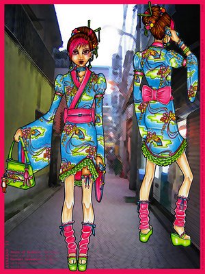
catzilla and panda-eyes This one suprised the most. simply because they took a risk and decided to go for it. At first glance, its like what the? but as you study all the details of the design, it grows on you fast. I applauded the team's inventive use of fabrics, when I heard that they were using a vintage pattern for thier design I said "uh-oh…"but they transformed it into something truly fabulous. In fact, the pattern is a work of art all on its own. It's just too bright. There's not really a focal point to the outfit. It makes you want to look everywhere at everything. The cut and style of the outfit are nice, but there is just too much going on, and while it's definately creative, it's too loud.You can tell these two had so much fun working together. Alot of people want that bag!

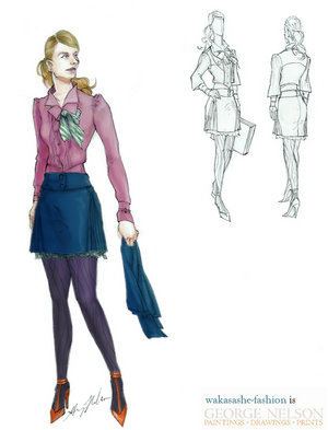
lasmith and ceazar You can instantly tell these worked well together, their seperate styles complemented each other perfectly. The structure of the desgin was well thought out, The only thing I would say, it didnt really feel victorian to me that much. I think its the print on the dress that did it, reminded me of 50's feel. It was hip, youthful, sexy, and upbeat with a splash of spice-stunning.
All the colors go perfectly together without being too "matchy-matchy". The Victorian inspired coat is very well designed with the nice godet inserts to give it that extra flare without the bulk. The dress is adorable and would be gorgeous just on its own. All the textures and the rouching really make this a fun outfit. The teamwork behind this design was perfect -- both designers points of view can be seen without any clashing.
A very good collaberation.

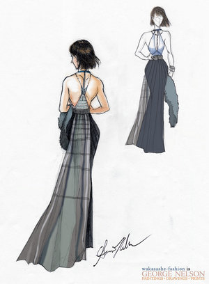
wakasashe-fashion and sparklefly Note: Only one of the two will be out. We will interview them, and will choose who will be in (so designers you should start creating your designs until you know that you are out.) Their styles you could see had simular taste in designs, and this reflected well in thier collab. As for the design, it was well thought out and exicuted; though not inappropriate, I feared that the judges would find this particular work to be too much of an "already done" piece and that our judges would begin to brand the team with a "safe" label, which would not be good for the them. Yes, it was an open design topic but really they could have maybe added more details in the bust that was wakasashe, and kept the rest. Maybe a broch on the jacket? While I consider the team's design to be great and powerful, the investment — design and detail— was minimal when compared to thier peers. Alone, fabulous.


Tuesday, August 22, 2006

Guest Judge: taeliac

wakasashe It seams (pun intened) that wakasashe-fashion never disappoints. The look was classy and elegant (his thing). I just wished that I would have known the fabric of the body of the dress. George’s building was Jin Mao building in Shanghai, and I wasn't sure how he would do, especially considering that it was so straight and had a big pointytop. He designed a halter dress with attention to the bust and back and it looks wonderful. The stole and train were a wonderful addition. From the moment that the model appeared on the screen, George had the judges completely seduced. He'll be back next week folks!

catzilla A gorgeous, non-literal translation! The tiered skirting is absolutely lovely, the colors are fab, and the whole gown looks very comfy and would give a nice floating effect while going down the runway. A lot of referencing was done for this design, which really made it great. The little bits of blue detailing really made this one stand out, and she should be proud of this design!!! The original sketch idea seemed to do so much more with the wing-skirt detailing than the final image did, and maybe that was just in the sketchy nature of the drawing. Otherwise, this is very inspired, and it was great seeing some of the period in which the building was made added to the look of the garment. The color choice was unique, and work very well with the whole outfit and period.WOO!

panda-eyes Even though it was literal, it was fabulous. I have to say, on first glance I was suprised to see the building actually there. Looking at it longer, it just all seemed to fit together and work. The scarf part, is a great idea, and the sky-blue color the perfect choice for a building that soars into the air. We love the pattern at the bottom, kinda like windows! It's amazing...really..this one was definatly hard to beat.

lasmith My first thought was on the unique colors of the piece - they stand out, and make a true statement. Then, I looked at the technicals of how this could be made, and realized that it isn't difficult at all (all be it time consuming). It has a completely modern feel, like it just jumped out of a movie like Aeon Flux, but is still something that could be worn. Very well illustrated, and the presentation was impecable. It looks like it could glide down the runway with not problem. My only nick pick is that the golden window like things look a little too literal, but other than that it translates wonderfully. I loved the fabrications and the seams. The lines were wonderful and I loved the sleeves. All in all it was a wonderful submittion.


sparklefly Wow, this gown looks fit for a Queen. It has a very classic look to it, with gorgeous details. Simplistic, yet complex with all the shapes and patterns on the bodice and the hem. The train gives the whole ensemble a more fun, and less strictly elegant, look. The colors were wonderful and the sparklefly empire waist is back! It was woderful, but I thought the arches in the bust was kind of literal, but that was a slight mishap. It was wonderful! This really is a romantic dress - the train does it especially! I like all the little details, including the bodice design, and using all the patterns of the pretty design found on the building itself. The only thing that I didn't care for was the skirt itself - I couldn't figure out how it would actually look from the sketch. The color choice, however, was very good - it just adds to that romantic feel.As Michael Kors says, Kudos!

ceazar A disco ball! The outfit was a disco ball. It was wonderful! All of the sparkle and glam, all added up to the Taj Mahal. I was so glad that he didn't do white, he did a creme print which was lovely. The draping and layering was masterful and the embroidery was wonderful!!! Stunning. The colors and details are wonderful - all the use of the rhinestones, really balance the whole design out. I just, somehow, feel that this is lacking the punch that really denotes it as the "Taj Mahal", although the longer I look at it, the more it appeals to me as a whole. I think it's something about the bodice that throws me off a bit, but either way, this is something I would love to see realized.
I hope to see even more fabulousness in the next round!

Out:Adeladia Everyone was so good, it was hard to choose who would be out. We love the whole idea of the "neighborhood" affecting the outfit, instead of just focusing on the Opera House itself. The hat and skirt, however, seemed to be the focus (and I cannot forget the purse - that is the greatest accessory!) and the corset piece seems to be unweildly, and very much uncomfortable to wear, especially from the side view. The pictures, however, helped to make more sense of that view, but it still feels like it's something that is a bit bulky. The bodice designs should have been panels rather than layered shapes though. Gives it a slightly odd appearance from the side angle. The hat is very dramatic yet fitting, and the belt and the skirt patterns are cute. The color scheme was very well thought out. Not so sure the shoes work with all the stuff standing out like that. Maybe if it were an embedded pattern instead? Or if the shoes were cut to to that kind of shape/design? That would have been very creative. And one word for the purse - adorable! Good luck Adeladia with your future ambitions!

Tuesday, August 15, 2006

wakasashe-fashion A very professional and strong outfit, although the length of the skirt is questionable. It looks like it was shrunk in the wash or is a size too small. The shoes are a great design as well but to me the switched in color is not the best choice(I loved the orange shoes).The whole thing was excellent and it was bold and sexy, yet sophisticated and romantic. And..you have immunity from being elimanated from the next challenge!

sparklefly hit everything right with this. The proportions were perfect, with her fabulous wide legged pant, and the oatmeal plaid. The conservative navy blue was a great addition and made the whole presentation more appealing. We liked the cut of the jacket and the placements of the buttons. The trimmings were perfect and the whole look was polished, restrained, and feminine. She sparkle, it can be done without being boring! Clap! Bravo! Encore!

panda-eyes The silhouette of the design is beautiful and sleek, but everything else to me seems out of place. I like the texture fabrication of the suit w/ gored skirt, but having it ribbed with leather? I never heard of this. From my stand point, ribboning this conservative outfit w/ leather automatically switches the mood and makes it slightly costumy and eccentric. Depending on what kind of leather, any of them would take it heavy looking. It also destroys the interesting texture it had. If only the ribboning were made of something softer and more appropriate. The shirt underneath doesn't belong...it looks mass produced and also gives 2 different moods throughout the design. We would have let the shirt be neutral red for the matching of the bow. I have to admit that I'm not usually drawn to the whole red and green combo being that they are contrast colors and can make my head hurt when put together...but the light shade of the green goes perfectly with the cherry red! Although I'm not sure what fabric the main green of the outfit is made of...the pattern and color is great! And I LOVE the idea of having a green leather trim!

Beautifully done and executed!

ceazar ceazar’s work has been consistently strong ever since the first challenge, but in this, the same fabrics yet again...but a beautiful design nonetheless. The sleeves and vest all worked out well (you have a knack for picking fabrics and colors) and the pants were great. The whole thing was interesting, and very well executed. The only thing that worried me was the single button..it just looked odd...but maybe that's just me talking.

Adeladia This is poorly illustrated. I can understand if people have their own illustration style, but when you want to convince people that your garments aren't costumy, you have to illustrate it and present it more realistically so we can get persuaded. This looks like a costume from head to toe, but reading the description...I'll just believe it's just Haute Couture. I like the colors and texture mixing with the skirt being double layered with lace, but it's not meant for career wear. It has no feeling of career or any style available within that range. The top with that dramatic color can actually work if everything else related more appropriately. When designing for something specific like bridal, career, costume or even concerts...the design must look believable and appropriate in a competition at least, even if it's Haute Couture.

catzilla The colors were on spot all the way. It wasn’t boring there were always little surprises to be found in the design, and it was defiantly a risk to use. My only complaint is the lining. It doesn’t really play into the whole piece well. However, this design was defiantly up there ^^! It’s great, and it’s defiantly a contender for the win.

lasmith . I understood the jacket and I responded well to it. It was art, and it was captivating on its own. But once it was paired with the skirt, it looked strangely proportioned and, um, odd. It was paired with another peculiarity, a vest with suspenders that was about a close to weird and um, odd as one could possibly get. Huh? I thought it was preposterous looking, but then I can be one-sided. I told myself, “Well, at least it’s kind of sophisticated. And at least it’s not too boring (the pleats saved the look).” Lasmith, next time be a little more careful.

OUT: ilani It looked all over the place. The whole outfit looked thrown together at the last possible minute. Maybe if the colors hadn’t been so wild it would have worked better. Maybe playing it down with a black or something. I personally loved the top and jacket, but the skirt it what messed everything up. It was bold and rushed and pinned and frilled…it was just too much. I’m REALLY sad to see you go ilani…you were defiantly a interesting one to see every week! But someone had to go. :hug:

Monday, August 07, 2006

ceazar Alright. First off even though the one he didn't color was the one that wasn't very him HE NEEDED TO COLOR IT! It's part of making a professional looking and cohesive illustration! *heh hem* Other than that I think he did a FANTASTIC job! We just loved the design that represents him! It's so fun and chic!...gosh and that vest is to die for! The colors flowed together, but I wasn't too particular about the chiffon for the skirt...maybe a satin? But ultimately it was his design. The design that wasn't him was boring and frumpy. Which makes since because ceazar's style is anything but that. It was dasturdus, horrendous, and B-O-R-I-N-G. Great job ceazar!!

Adelaida designed two colorful and risky outfits as usual. I really don't think she cares about being out...and that's a good thing. She takes risks, and as I mentioned before, I love risk takers. And this risk worked. Her fabrications and ebullient colored prints were great, and I loved the brown one, the unusual silhouette, fabrics, and shapes worked! It was definitely a strong showing and a contender for the win!

panda-eyes Well, there are a couple things I see that don't relate to the challenge. First off, it was said that the two outfits must be completely different. The styles are different, but the outfits are similar. Both have a top and a skirt. Both have knee high socks. Both have hand socks too...well, the first has 1. Either way, the outfits should have differed garment wise to get the greatest effect of differentially. Second off...the first I can see being worn. The second looks more like a costume MEANT for a character. We don't want to design clothes for characters; we want to design clothes for real people. Totally off point.


lasmith was defiantly a contender for the win. The silhouette of the design and the colors were to die for. The opposite design was crazy and mismatched with plaid and violet corsetry. I love pleating, so I was drooling over the dress and its monochromaticy. The fan under the buttocks, I think was in the wrong place…maybe above it? Then it would be perfect. Pat yourself on the back!!!

wakasashe-fashion was great! The silhouettes were wonderful and they were completely opposing. One was frilly, sophisticated, elegant, and modern. The corset looking thing on the bodice was wonderful (everyone knows I hate corsets, but this one is to die for!...if it is a corset.) It was delightful to look at. The opposite was a sporty pant with hoodie. It had little details that were wakasashe. It was the complete opposite but it was still him. I personally loved it.

catzilla Wasn’t as ambitious as I expected her to be. The design was simple, and I actually preferred her opposite. But her design was palpable and passable for the next round. I liked her fabrications, but maybe you guys could venture into some more unusual fabrics. The opposite design I COULDN’T see as catzilla basically because of the dark colors and the seriousness. The illustration kicks butt,Just different aproaches but two winning designs!

ilani I personaly loved both of them. The one on the right: loved the color. It was defiantly her, colorful and flowy... (The skirt). The sequin detailing made it kind of showgirlish though, but however, it was trendy, hip, and sexy. The opposite one was full of embellishments, additions, and adorns this and that. I personally didn't like the brown color on the skirt of the second one. It was straight and wasn’t very interesting silhouette wise.

sparklefly *sigh* Yes! It's great! She really did create an outfit that shows her style and one that shows the opposite. Her outfit is kind of vintage yet simple and sleek. I love the idea of doing a knit dress with kimono style jacket...classic. I especially loved the tights with the color of the shoes, classic as well. The other outfit's kind of punk rock hip and trendyish and I couldn't really say I liked this one. It was juvenile and not really designed. The shirt was horrible and I disliked the tights so much...but it was the opposite of her design aesthetic...so sail on sparklefly...sail on.

OUT: adriannauk (Had to quit for personal reasons.)